Blog
Theirs & Ours
February 10, 2017


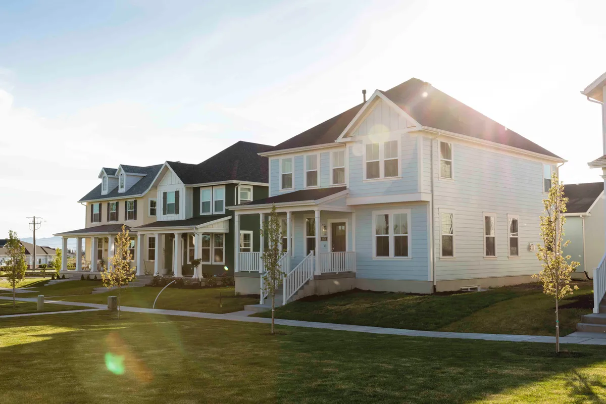
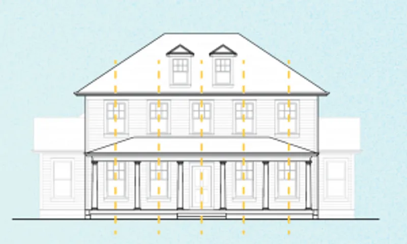
The example on the left shows a grouping of random features. Nothing is aligned, nothing has a match, nothing is symmetric. It's a Frankenstein of functionality, but at the sacrifice of visual aesthetic and architechtural style. The colonial style elevation on the right demonstrates order and style with symmetry, and with element aligned to their center.  Considering that the 2-story home on the left has one tiny window on the second level (most likely a bathroom) indicates just how little natural light can be felt inside. The different sections of the home on the right may not be perfectly symmetrical in the roof line, but accompanying elements such as windows and doors should still look great.
  Alignment is important in architecture. On the left we see that the lack thereof communicates a less than orderly and somewhat sloppy picture. Mixing sliding, hung, and picture windows in varying sizes adds to the feel of randomness flowing from the side of this home. On the right, we see that even though the windows are not all the same size, they are all centered in their respective sections.
  The features on the back side of this home on the left show that the exterior look of the home was an afterthought result of the interior flow. Window alignment is off, window sizes are mixed, and the left roof line pitches awkwardly. The example on the right is of an ally-load garage that still gives way for some nice visuals and plenty of windows. There is still balance although visually there are different elements presented from the left side of the home to the right side.
Latest Posts
Sep 17, 2025
New Home Move-In Process: Everything You Need To Know
Jul 10, 2025
You Made It: Discovering Destination Homes
Jun 5, 2023
Welcoming Wilcox!
Apr 21, 2023
Up to $20,000 of Financial Assistance for First-Time Homebuyers
Apr 13, 2023
Preparing Your Home for Potential Spring Flooding
Mar 1, 2023
5 Garage Organization Tips to Cut the Clutter
Nov 15, 2022
Progress on the long awaited Watercourse in Daybreak!
Oct 12, 2022
Hill Farms Weekend Walking Inventory Tour
Aug 17, 2022
Beyond the Basics: 25 Questions to Ask Your Future Builder
Previous Article

Buyer Savings in Windmill
Next Article